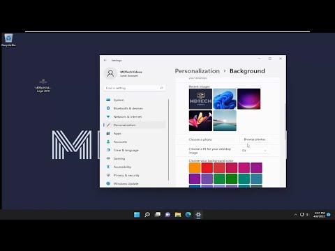
I vividly remember the day I stumbled upon what seemed like an unremarkable issue, only to find myself tangled in a web of technical intricacies. It all started when I decided to refresh my Windows 11 desktop background. After months of using the default wallpaper, I felt a strong urge to personalize my workspace. The problem seemed simple enough: I wanted my new wallpaper to fit perfectly on my screen. However, the options for adjusting how the wallpaper appeared—Center, Fill, Fit, Stretch, Tile, Span—left me feeling more confused than I had anticipated.
Initially, I selected the “Fill” option, expecting it to do just what it said—fill the screen with the wallpaper. Yet, to my dismay, the edges of the image were cut off, and it didn’t display as I had hoped. The next option I tried was “Fit,” assuming it would shrink the image to fit within the screen boundaries. While this preserved the entire picture, it left annoying black bars on the sides of my monitor. Frustration set in as I moved on to the “Stretch” option, which distorted the image, making it look warped and unrecognizable.
In an attempt to understand the problem better, I decided to give the “Tile” option a shot. I envisioned a repeating pattern that would cover the screen seamlessly. However, the image turned into a series of repeated tiles that looked chaotic and unappealing. As a last resort, I tried the “Span” option, which I thought would expand the wallpaper across multiple monitors, but I only had one monitor, so it was a complete mismatch.
Determined to resolve this issue, I started diving deeper into each option to understand what they truly did. The “Center” option, I realized, simply placed the image in the center of the screen without altering its size. It was the simplest of all options, but it didn’t address my problem of having a full-screen image. “Fill” seemed like it should be the solution, but it only cropped the image. “Fit” was helpful in showing the entire image but wasn’t suitable for my screen size. “Stretch” distorted the image beyond recognition. “Tile” created an unattractive pattern of the image, and “Span” was irrelevant since I only had one display.
After considerable effort and research, I discovered that the key to resolving my issue was understanding the nature of my wallpaper image and the resolution of my monitor. The wallpaper I had chosen was not originally designed for my screen’s resolution. The image itself was smaller than my monitor’s resolution, which was why “Fill” resulted in cropping and “Fit” left black bars. The distorted effect from “Stretch” occurred because the image was being forced to match the screen’s aspect ratio without maintaining its original proportions.
The first step I took was to find an image with a resolution that matched my screen’s resolution. This meant searching for high-quality images that were designed for widescreens or using tools to resize images while maintaining their aspect ratio. By resizing the image to match my monitor’s resolution exactly, I could then use the “Fill” option without cropping. This way, the image filled the screen perfectly, without losing any part of the picture.
For future reference, I also learned to use image editing software to adjust wallpapers. With programs like Photoshop or GIMP, I could crop, resize, or fit the image to my exact needs before setting it as my wallpaper. This allowed me to ensure that the wallpaper would always display correctly, regardless of the option I chose in Windows 11.
Understanding these options was crucial. “Center” is ideal for images that you don’t mind being smaller than your screen, as it displays the image in its original size and position. “Fill” works best when the image resolution is equal to or greater than your screen resolution. “Fit” is suitable for images that you want to display in full but are okay with black bars around the edges if the image is smaller than your screen. “Stretch” should be avoided if you don’t want to distort the image. “Tile” is best for patterns and images designed to repeat seamlessly. Finally, “Span” is only relevant for multiple monitor setups.
In the end, the solution was both simple and complex. It required a mix of understanding the options available, knowing the limitations of the wallpaper image, and adjusting the image to fit the screen perfectly. What seemed like a minor inconvenience turned into a valuable lesson in desktop customization. By addressing the issue methodically and using the right tools, I managed to achieve a visually pleasing and functional desktop environment.
