I remember the first time I needed to add some flair to my Word document. I had been working on a project for weeks, pouring over details and ensuring that every piece of content was perfectly crafted. However, I realized that the plain text in my document didn’t quite capture the energy and excitement I wanted to convey. The moment I decided I needed to make my text stand out, I found myself grappling with the multitude of options available in Microsoft Word. It was a bit overwhelming at first, but I managed to navigate through the features and apply some effective text effects to enhance my document. Here’s how I did it and what I learned along the way.
The first step was to understand what I wanted to achieve with my text effects. I had a specific vision in mind: I wanted certain sections of my document to draw attention without overshadowing the main content. After some thought, I decided on a mix of bold, underlined, and color-enhanced text, as well as a few creative touches like shadows and reflections. Knowing what I wanted made it easier to navigate the options available in Microsoft Word.
I began by opening my document and selecting the text I wanted to modify. The “Home” tab in Microsoft Word is where most of the text formatting options are located. For basic text enhancements like bold, italic, or underline, I used the respective buttons in the Font group. However, to apply more advanced effects, I needed to dive deeper into the text formatting options.
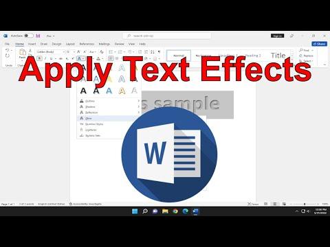
The next step involved accessing the “Font” dialog box to explore the more nuanced text effects. I clicked the small arrow in the bottom right corner of the Font group on the Home tab, which opened up a dialog box with additional formatting options. It was here that I discovered the “Text Effects and Typography” button. Clicking on this brought up a menu where I could choose from various text effects.
One of the most exciting options was the “Text Shadow” effect. I selected this option and was able to adjust the shadow’s color, size, and distance from the text. This effect gave my text a three-dimensional appearance, making it pop against the page. I chose a subtle gray shadow to add depth without making the text too flashy. It was a simple yet effective way to enhance the visual appeal of my document.
Next, I experimented with the “Glow” effect. This effect was perfect for drawing attention to important headings or key phrases. I selected the “Glow” option and then adjusted the glow color and size to suit my needs. I found that a bright blue glow worked well for headings, making them stand out prominently while remaining professional.
The “Reflection” effect was another feature that intrigued me. It allowed me to create a mirrored effect of the text beneath it, which can be especially eye-catching. I used this effect sparingly, applying it only to certain text elements where I wanted to create a strong visual impact. The ability to adjust the transparency and size of the reflection helped me achieve the perfect balance between subtlety and emphasis.
Color customization was another critical aspect of applying text effects. I used the “Font Color” button on the Home tab to change the color of my text. Choosing a color that complemented the overall design of the document was crucial. For example, I used a dark blue for most of the text and a bright red for key points that needed emphasis. Microsoft Word offers a wide range of colors and even custom color options, which gave me the flexibility to match my text color to the theme of my document.
To add an extra layer of distinction, I used the “Highlight” feature. This feature is useful for drawing attention to specific parts of the text, such as important quotes or critical data. I chose a soft yellow highlight that was visible but not overpowering. It worked well in combination with the text effects I had applied, ensuring that the highlighted sections stood out without clashing with other formatting.
Once I was satisfied with the text effects, I reviewed the entire document to ensure that the effects were consistent and aligned with the overall design. Consistency was key to maintaining a professional appearance. I made sure that the same types of text effects were used for similar types of content, such as using the same shadow effect for all headings.
As I looked over my document, I realized how much the text effects had enhanced the overall presentation. The carefully chosen effects drew attention to key areas and made the content more engaging. I was pleased with how the combination of shadows, glows, reflections, and colors worked together to create a visually appealing and effective document.
In conclusion, applying text effects in Microsoft Word can transform a simple document into something visually striking. By experimenting with different options such as text shadows, glows, reflections, and color changes, I was able to enhance the impact of my content and highlight important information effectively. The key is to have a clear vision of what you want to achieve and to use these tools in moderation to avoid overwhelming the reader. With a bit of practice and creativity, anyone can use text effects to make their documents stand out.
