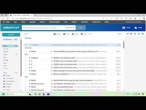
I vividly remember the day I decided to change the message layout on Yahoo! Mail. It all started when I was working on a project that required me to handle a large volume of emails. My inbox was cluttered, and the default message layout seemed inefficient for my needs. I realized I needed a more organized and visually appealing way to manage my emails. After some frustration and a fair bit of searching, I figured out how to change the message layout on Yahoo! Mail, and I want to share this experience with you to make it easier for others facing a similar issue.
Initially, I was overwhelmed by the Yahoo! Mail interface. The standard view seemed to pack everything too closely together, making it hard to distinguish between different types of emails and their statuses. The default layout was functional but didn’t cater to my specific needs. I wanted a way to make my email experience more streamlined and less stressful. So, I began exploring the options available to customize the message layout.
The first step I took was to log into my Yahoo! Mail account. Once logged in, I found myself on the main inbox page. This was the moment when I realized that Yahoo! Mail doesn’t offer a direct option to change the message layout as extensively as I had hoped. However, there were a few options available that allowed for some degree of customization.
I started by clicking on the gear icon, which is usually located in the upper right corner of the Yahoo! Mail interface. This icon represents the settings menu, where most of the customization options are hidden. I clicked on it and a dropdown menu appeared, providing several options. I selected “More Settings” from this menu to dive deeper into the customization features.
In the “More Settings” section, I navigated to the “Viewing email” tab. This is where Yahoo! Mail offers some basic options for adjusting how messages are displayed. I found the settings under “Viewing email” to be somewhat limited but still helpful. There were options to change the theme and adjust the layout of the email list, which was a good starting point for tweaking the interface to suit my preferences.
One of the first changes I made was selecting a new theme. Yahoo! Mail provides a range of themes that can alter the overall look of the inbox, including background colors and fonts. I chose a theme that had a cleaner, more minimalist design, which helped reduce visual clutter and made the inbox look more organized. This change alone made a noticeable difference in how I interacted with my emails.
Next, I focused on the layout of the email list. Yahoo! Mail allows you to choose between different viewing options for the list of messages. You can select from views like “Conversation View,” which groups emails by thread, or “Individual Emails,” which shows each email separately. I opted for the “Conversation View” because it helped me track email threads more efficiently and keep related messages together.
Additionally, I explored the option to adjust the density of the email list. Yahoo! Mail provides choices for “Compact” or “Cozy” view. The “Compact” view displays more messages per screen by reducing the spacing between them, while the “Cozy” view provides more space around each email. I tried both options and found that the “Compact” view was better suited for managing a high volume of emails, as it allowed me to see more messages at once without excessive scrolling.
To further refine my email experience, I made use of Yahoo! Mail’s sorting and filtering features. I organized my inbox by creating folders and setting up filters to automatically sort incoming emails based on their content and sender. This organization system complemented the layout changes I had made and helped me manage my emails more effectively.
Despite the improvements, I still felt that the default Yahoo! Mail interface had its limitations. For more advanced customization, I researched third-party tools and extensions that could offer additional layout options. Some of these tools were browser extensions that integrated with Yahoo! Mail and provided more control over how emails were displayed.
One such extension I found was a browser add-on that allowed for advanced customization of Yahoo! Mail’s interface. It provided options to change the color scheme, adjust the layout of email threads, and even add additional widgets to the sidebar. While using third-party tools always carries some risk, this particular extension had positive reviews and seemed to be reliable. I decided to give it a try and found that it greatly enhanced my ability to tailor the Yahoo! Mail interface to my liking.
In conclusion, changing the message layout on Yahoo! Mail required a combination of built-in settings adjustments and external tools. While Yahoo! Mail’s default settings offer some degree of customization, exploring additional options and using third-party tools can provide a more tailored and efficient email experience. The process I went through helped me transform my inbox from a cluttered mess into a well-organized workspace, and I hope sharing my journey will assist others in achieving the same result.
